

The Art of the Ale Trail
Recently I was approached by Stockton BID (Business Improvement District) to produce an illustrated 'Ale Trail' and map for them.
Recently I was approached by Stockton BID (Business Improvement District) to produce an illustrated 'Ale Trail' for them.
The Stockton Ale Trail highlights the impressive selection of real ale pubs that Stockton has to offer. Previous incarnations of the Ale Trail map had done the job, but were lacking in visual appeal. This time around my client wanted something with a little more flair, to tantalise prospective drinkers.


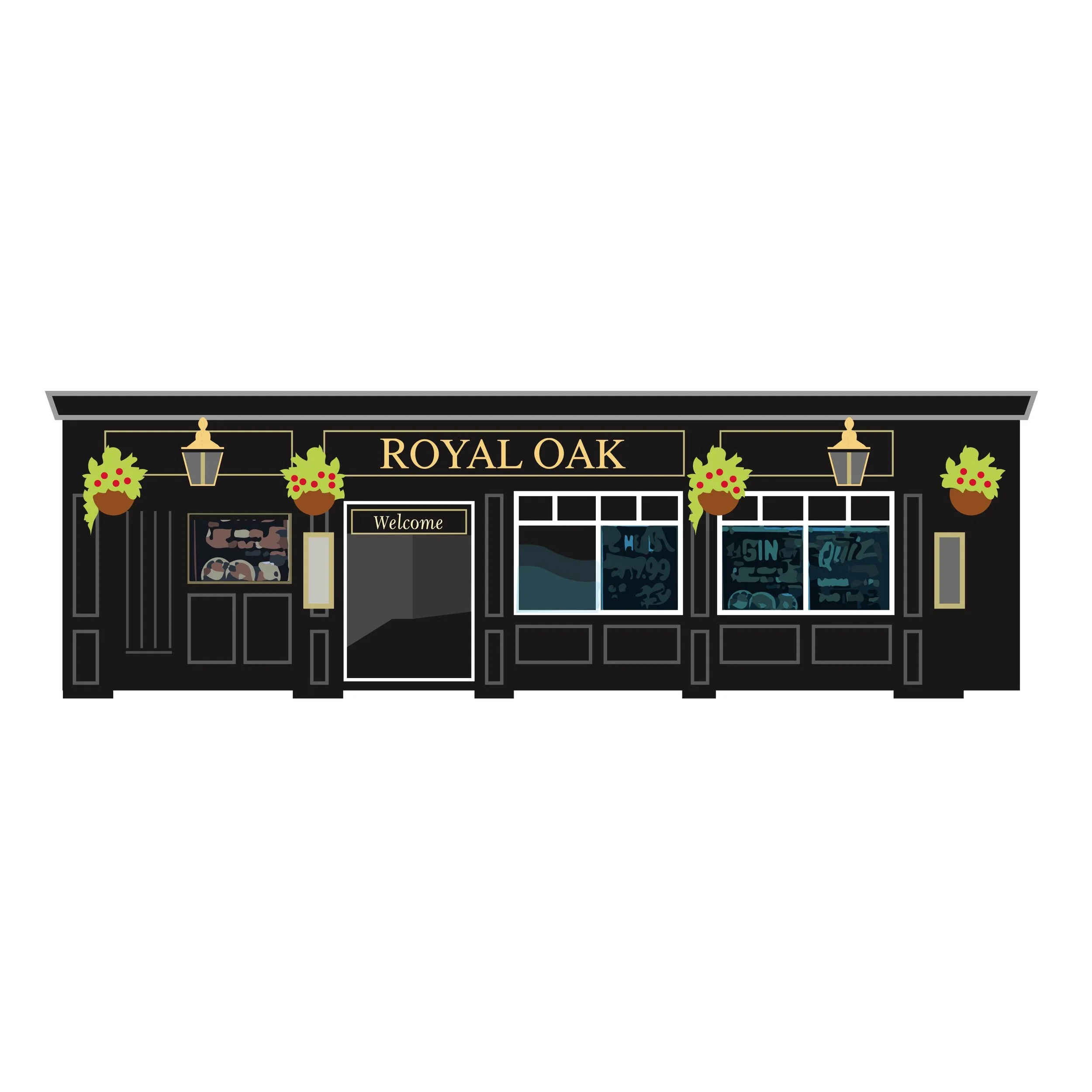
I was tasked with producing eleven original illustrations of the pubs around Stockton, from cheerful town centre pubs and vibrant little bars, to the beautiful micro pubs tucked away in the town’s Cultural Quarter. I also designed the foldout Ale Trail Map, along with a beautiful brand identity for the trail itself, including a striking logo, and a pattern featuring bottles and pints of ale. This brand will likely be expanded upon for future trails and guides in Stockton.
The illustrations represent Stockton as a true haven for those of us who enjoy a great pint of ale. I had the pleasure of visiting each of these pubs to take reference photographs for the illustrations. Each pub owner was also gifted with an illustrated print, to proudly display in their venue.
The Stockton Ale Trail has a total of eleven carefully selected pubs, (there are plenty more gems to discover about the town). Eleven may sound like rather a lot, but you don’t have to try them all in a single day! To pick up your copy of the Ale Trail Map, just pop into any of the eleven pubs on the trail: The Golden Smog, The Thomas Sheraton, The Storytellers, Lucifers, Musiclounge, The Georgian Theatre, Hope & Union, The Wasps Nest, Ivy House, The Sun Inn and The Royal Oak.




The leaflet folds out to show a large illustrated A3 map on the reverse.


Each pub got a framed print of their pub, above shows Storytellers, Thomas Sheraton, Ivy House and The Hope & Union with their print.

Press Release: Stockton Zak Newton's legacy is restored by a new hand
‘AN ARTIST inspired by vintage travel posters has restored a piece of artwork situated at the heart of a town's cultural hub…’

‘AN ARTIST inspired by vintage travel posters has restored a piece of artwork situated at the heart of a town's cultural hub.
Graphic artist Abby Taylor, from Stockton, set to work on the mural of Saint George the Dragon Slayer, a painting which hangs in the town's Green Dragon Yard.
The mural was originally created for the Georgian courtyard by local artist Zak Newton who passed away in 2013 but left behind a legacy of commemorative murals across the town.
In recent years, however, Mr Newton's Saint George has fallen into disrepair.
"One of the many features of the Green Dragon Yard that I have always enjoyed is the mural of Saint George the Dragon Slayer," said Ms Taylor, who creates vintage-like posters of regional landmarks.
"Sadly, over the years this beautiful mural has fallen into disrepair. The frame was coming away from the wall and sections of the mural were flaking away altogether.

"The restoration was quite a challenge, as many areas of the mural had faded completely, but I had loads of fun playing 'forensic art analyst' and reconstructing the face of Saint George the Dragon Slayer and putting a bit of my soul into the restored mural."
Ms Taylor was commissioned and chosen by Stockton BID to be the mural's official restoration artist.
Ms Taylor added: "I was delighted when local initiative Stockton BID enlisted me as the official 'restoration artist' for the mural.
"Stockton BID is a partnership between local businesses and organisations with the ultimate aim to make a difference to the town centre, and the Green Dragon mural is a perfect example of a corner of Stockton that urgently needed some TLC.

"This was also an opportunity to better signpost the yard by including the text, Green Dragon Yard, which is a beautiful courtyard of repurposed historic warehouses and Georgian alleyways and houses the Green Dragon Studios, Green Dragon Pub and the newly renovated Georgian Theatre."
Jason Maxwell, Manager at Stockton BID, said: “We have worked with Abby on a project to update an old piece of art for our town centre.
She is super talented and very creative. She has done an amazing job and I am really proud of what she has produced for us.”
- Article by Paige McDermott for The Northern Echo
Press Releases were also published in Stockton & Darlington Times and Stockton & Billingham Life.

Stockton Borough Council Commission Official Illustration for The Globe
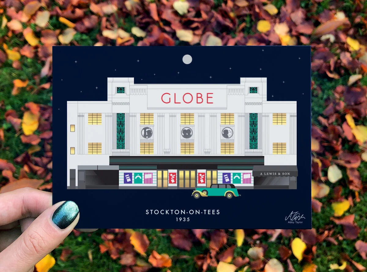
I'm delighted to announce that I will have played a small part in adding to The Globe’s legacy, by creating an official illustration of The Globe for Stockon Borough Council.
What do The Rolling Stones, The Bee Gees, Roy Orbison, Morecambe & Wise, T-Rex and The Beatles all have in common? Answer: they all performed at The Globe, Stockon's legendary entertainment venue! And while I probably won't be gracing the stage there anytime soon, I'm delighted to announce that I will have played a small part in adding to its legacy, by creating an official illustration of The Globe for Stockon Borough Council.
The Globe is a stunningly unique venue on Stockton-on-Tees High Street steeped in a rich history of entertainment. It is currently being brought back to life by Stockton Borough Council.

Illustrating this beautiful grade 2 listed building was no small task, as The Globe is considered to be of National architectural importance, but I was determined to do it justice. I was lucky enough to get a hard hat tour of the building during the ongoing renovation, which gave me some insight into what a breathtaking space it was, and will be again, once it reopens in 2020.
My illustration features the Globe as it looked when it first opened in 1935. As the building has been through many visual changes since then, I needed to piece together a complete image of the venue by sifting through a modest archive of old photographs and architectural plans.
A highlight of the illustration is the swanky car parked outside, which would have belonged to the local butcher that set up shop on The Globe premises back in 1935, and was reportedly a big fan of flash cars! (It's amazing what you can learn from speaking to those in the Teeside community who still have fond memories of The Globe and its many characters).

“Working with Abby on her recent Stockton Globe graphic illustration commission was an absolute pleasure. She is a talented professional, listens to the requirements of the client and brings her creativity to the process. Abby understands the value of the artwork and demonstrated originality as well as in-depth knowledge of the sector. She is committed to achieving the best outcome and worked incredibly hard for us, within a tight timeframe.”
The illustration is currently available as an A3 art print (£8) and A6 postcard (£1), which can be purchased from Rediscover Stockton and Preston Park Museum. Postcards can also be picked up at the Hampton by Hilton. Further merchandise is likely to be developed in the future, so keep your eyes peeled!
All proceeds from the merchandise are going back into The Globe too. The money will go towards supporting The Globe community organisation, which will celebrate the building’s heritage into the future.
The Globe is set for a Grand reopening in 2020, soon to be the jewel in the crown of the Town Centre. I'll be celebrating by creating a second illustration of The Globe as it looks after the renovation is complete, making for a wonderful pair of past/present illustrations.
f you're interested in commissioning some original artwork that creates the perfect first impression, why not get in touch?

Green Dragon Yard Mural Restoration
A behind-the-scenes look at restoring Zac Newton’s much-loved Green Dragon Yard mural in Stockton-on-Tees, from reconstructing Saint George to adding fresh illustration, texture and clearer wayfinding.
The Green Dragon Yard is a beautiful courtyard of repurposed historic warehouses and Georgian alleyways in Stockton High Street. Considered the cultural quarter of Stockton, it houses the Green Dragon Studios, Green Dragon Pub and the newly renovated Georgian Theatre, see my illustration of The Georgian Theatre here.
One of the many features of the Green Dragon Yard that I have always enjoyed is the mural of Saint George the Dragon Slayer, by artist Zac Newton. Sadly, over the years this beautiful mural has fallen into disrepair, and in recent years the original artist passed away. The frame was coming away from the wall and sections of the mural were flaking away altogether.

The Original Mural
I was delighted when local initiative Stockton BID enlisted me as the official 'restoration artist' for the mural. Stockton BID is a partnership between local businesses and organisations with the ultimate aim to make a difference to the town centre, and the Green Dragon mural is a perfect example of a corner of Stockton that urgently needed some TLC!
The restoration was quite a challenge, as many areas of the mural had faded completely, but I had loads of fun playing 'forensic art analyst' and reconstructing the face of Saint George the Dragon Slayer and putting a bit of my soul into the restored mural. This was also an opportunity to better signpost the yard by including the text, Green Dragon Yard.
There was something strangely beautiful about the way the old mural had aged in places, and this gave me the idea of adding some new and interesting textures to the mural.

Working away on the restoration in my studio

Close-Up of the textured illustration
Jason Maxwell, manager at Stockton BID, had this to say about working with me on the project…
““We have worked with Abby on a project to update an old piece of art for our town centre. She is super talented and very creative. I would not hesitate to recommend her to others and cannot wait to work with her again….I absolutely love it, she has done an amazing job and I am really proud of what she has produced for us.””
Here's a short time lapse of the piece as it came together...


Trendsetters installing the new artwork


Do you know of any old murals that could do with being restored? Or perhaps there's a perfect spot in your town for a new mural to brighten up the place. If so, feel free to get in touch using the contact form.

Schoolchildren’s Winning Logo Made Into a Reality
Hartlepool Borough Council has had a grant from the National Lottery Heritage Fund to breathe new life into the Church Street Conservation Area. They put out a competition out to schools and colleges for The Church Street Revival’s new identity, I got involved by making the winning Church Street Revival logo digital, which was designed by two school children, Connie Brydie and Isabelle Judson.

Hartlepool Borough Council has received £1.1million grant from the National Lottery Heritage Fund to deliver a three-year project to breathe new life into Church Street Conservation Area. The aim is to improve the quality of the built environment in the Conservation Area and raise awareness of the area’s rich heritage.
Thus, The Church Street Revival Project was born, they needed a logo and decided to put out a competition for local schools, colleges and the Dabble Art Group, they got over 300 entries. Connie Brydie and Isabelle Judson from West Park Primary School were the winners of the competition, with their vibrant circular logo using the Christ Church building as the focal image against a setting sun.
I got involved by working with Connie and Isabelle to develop the final design, which involved showing them how the logo was drawn up, important elements to think about when designing a logo, and allowing them to take ownership of their design by choosing the colour scheme and type layout.
The aim of the Church Street Revival Project, which is supported financially by the National Lottery Heritage Fund, is to improve the quality of the built environment in the Conservation Area and raise awareness of the area’s rich heritage.
To find out more about Hartlepool Revival and how you could get involved in the activities or volunteer hartlepool.gov.uk/churchstreetrevival
“Abby was brilliant at working with the Connie and Isabelle, the Church Street Revival logo competition winners from West Park Primary School. She was inspirational in her approach, clearly explaining how she had worked with their original drawing to develop options, from which they collectively chose a final digital logo image. ”

The Church Street Revival Team alongside myself, Connie and Isabelle

Connie and Isabelle choosing the logo colour scheme and typography position they liked best.


Tensile Strength (or How to Survive at Your Wit’s End) Tour Posters are Looking Sharp
Holly Gallagher approached me to create promotional materials including a bespoke illustration for her latest show Tensile Strength (or How to Survive at Your Wit’s End). Holly is a theatre-maker, director and facilitator who was keen to create a recognisable brand for herself and have promotional materials for her shows that will stand out from the crowd.
Between October 2018 and September 2019, Holly Gallagher is touring her latest show Tensile Strength (or How to Survive at Your Wit’s End). Holly is a theatre-maker, director and facilitator who was keen to create a recognisable brand for herself and have promotional materials for her shows that will stand out from the crowd. The goal was to create bold promotional items, but also set a distinct style, colour palette, font choices etc. so Holly’s future shows can follow suit.
The show was produced and commissioned by ARC Stockton, and funded by Arts Council England, and supported as part of the Third Angel Mentoring Scheme 2017 in association with Sheffield Theatres.

Tensile Strength (or How to Survive at Your Wit’s End) tells the story of three different characters all experiencing stress. The stage is full of buckets which act as a metaphor for stress, at one point in the show, the audience is asked: Imagine you have a bucket; and all the things you have to cope with in life as water going into that bucket. Raise your hand if your bucket is A) Empty B) Half full C) Overflowing.
After discussing the show over a hot drink with Holly, we decided an illustration involving an overflowing bucket would be perfect for the promotional materials. I included the show description ‘A Show About: Stress, fear, pressure ,sadness, mental health, when things are all a Bit Too Much and then the cat goes missing’ within the bucket which is spiralling into an abyss, much like how it feels when you get so stressed you can’t think straight. Holly also received brand guidelines which give her the colours, fonts etc. she needs to continue using her brand online.

“I have been a fan of Abby’s work for some time now, and have always particularly loved the boldness, detail, and colours used in her work. So when I needed a designer to work on my new show’s poster it was a no-brainer for me to approach Abby.
The process of working with Abby has been a real pleasure! This was my first time using a graphic designer to create content for a show, as well as the largest tour for a piece of work I had put together. So my timeframes, deadlines, and expectations were continually changing. Abby was understanding and flexible with every change that happened, and has been more than generous with her time and dedication to the project.
The final design Abby created is a beautiful piece of artwork and has really done an effective job in advertising the show with countless people complimenting its posters, flyers, and social media images! I’m beyond happy with the professional finish Abby has gifted my show with and am so pleased to have a proper brand design for my future work now too.
I would recommend anyone to Abby for graphic design work if they want a high quality, fast, flexible, and personable experience!”

Holly Gallagher’s stage set up for Tensile Strength (or How to Survive at your Wit’s End). Photo by Davey Poremba