

Finding Your Way - Refugee Futures
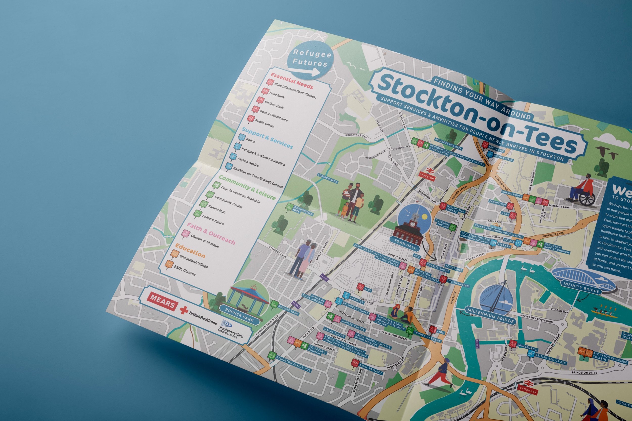
We collaborated with Refugee Futures, a local charity that helps refugees and people seeking asylum flourish, in partnership with The British Red Cross.
We collaborated with Refugee Futures, a local charity that helps refugees and people seeking asylum flourish, in partnership with The British Red Cross to create a comprehensive map and leaflet for Stockton-On-Tees, supporting those seeking support.
This resource connects newcomers with vital community services including affordable shopping, education opportunities, places of worship, and healthcare facilities. We're committed to helping everyone who lives here to feel welcome and empowered to thrive in Stockton, our hometown.
Proud to have helped bring this to life!
Learn more about supporting refugees and local community work here: www.refuguefutures.org.uk



Platinum Jubilee Community Artwork & Activity Pack
It was wonderful to see the crown collage we created for Stockton-on-Tees Borough Council, comprised of children's drawings on the choir's t-shirts for the Jubilee celebrations! We delivered a range of Jubilee activities, from wordsearches, colouring-in page and games to play.

It was wonderful to see the crown collage we created for Stockton-on-Tees Borough Council, comprised of children's drawings on the choir's t-shirts for the Jubilee celebrations! We delivered a range of Jubilee activities, from wordsearches, colouring-in page (by the super talented Anjalee Bee Illustration) and games to play. We had a lot of fun creating (and testing!) this one.


North-East Statues interview with Abby
Zak Newton’s George & Dragon mural was in a bit of state when Abby Taylor (one half of creative duo Abby+Owen) was commissioned to restore it. I interviewed her via email to talk about the work she did.

‘Zak Newton’s George & Dragon mural was in a bit of state when Abby Taylor (one half of creative duo Abby+Owen) was commissioned to restore it. I interviewed her via email to talk about the work she did.
Restoring a mural is always a controversial project, because it involves covering the work of the original artist. However, if nothing is done the mural is simply lost forever. I think the approach taken here – protecting the original by installing the reimagined version on top – is a sensitive and sensible solution.
Of course, I will be doing an article on Zak Newton’s original (as well as his other works in Stockton) but am currently trying to find more information about the man and his work. If you knew Zak, or have any information about his works, please get in touch at northeaststatues@gmail.com or leave a message.
All images were provided by Abby, thank you to her for her time and invaluable help.


Could you tell me a bit about how you got involved with the mural?
Owen and I live in Stockton and absolutely adore The Green Dragon Yard, it’s so rich with history and charm, we’ve always loved the mural but time hasn’t been kind to it and it has deteriorated a lot in recent years. The restoration was released in 2019, this was when I was starting the business and waiting for it to be sustainable enough for Owen to join, which he did in 2020.
The idea was initiated by Jason Maxwell at Stockton BID. He wanted to restore it and make it a proud feature of the yard once more. The installation was done by Trendsetters.
The mural was originally created for the Georgian courtyard by local artist Zak Newton who passed away in 2013 but left behind a legacy of commemorative murals across the town. We don’t know much about him, we asked around at the pub and he was a regular at The Green Dragon which is a Sam Smith’s pub, and they must have come up with the idea and commissioned him.

We wanted to protect the mural underneath, so the new piece is directly on top and installed in a way that it doesn’t damage what’s underneath and should protect it from deteriorating any further, or at least slow it down.
The piece was a fun challenge, there are so few photos of the mural we looked high and low in archives to find out what the wording above used to say so I could get it as accurate as possible. Also parts were completely worn away such as St George’s face, so creating his face was challenging. This was also an opportunity to better signpost the yard by including the text, Green Dragon Yard, which is a beautiful courtyard of repurposed historic warehouses and Georgian alleyways and houses the Green Dragon Studios, Green Dragon Pub and the newly renovated Georgian Theatre.


I carefully redrew the mural using a digital drawing tablet and added texture to the piece as well, trying to get a colour match for what the colours used to be like, and using a little bit of artistic license here and there, in particular to include the flag under the ‘And Peace Shall Rain!’ so it made the piece as one.’
See original article here: https://northeaststatues.com/2022/04/08/george-dragon-mural-restored-stockton-on-tees-abby-taylor-after-zak-newton-2019/


'Yeah! Let’s Do That' Getting into the Spirit of Play for Book Design
What better way to encapsulate “Yeah! Let’s Do That” than to follow the children’s lead? We really got into the spirit of play, incorporating cardboard, string, fabric, paint, card, bubble wrap and the great outdoors... we even baked a letter ‘T’ out of pastry!

The Whippet Up team use art and creativity as a way of working with people to improve wellbeing. They were looking to publish a book, "Yeah! Let's Do That", to capture some of the fun and joyful mess that they created with a group of under 5s and their parents over the past two years. They needed a cover design that would capture the spirit of the book perfectly, encouraging parents to play, make and invent with their kids. They also needed help with the layout, as well as creating a total cohesive feel and typographic style for the interior.

What better way to encapsulate “Yeah! Let’s Do That” than to follow the children’s lead when designing the front cover design? We really got into the spirit of play, incorporating cardboard, string, fabric, paint, card, bubble wrap and the great outdoors... we even baked a letter ‘T’ out of pastry! Each of the letters was inspired by activities throughout the book. The result is a bold title graphic that couldn’t be more apt for this project, nor less corporate! Finally, the scratch-built rocket, which appeared in one of the photos from Whippet Up, seemed too perfect not to incorporate.

“Yeah! let’s do that” was shouted back at the Whippet Up team whenever they took up ideas from the children. "We were artists on a creative journey," said Jane, "looking at how the imagination and creativity of under 5s could shape the way we work."

The book is packed with activity ideas for kids and adults to enjoy together, and we needed to create order out of that joyful chaos with a consistent style. Jane Cuthbert's illustrations are beautifully complemented by the custom lettering, and one of the fonts was even designed by a five-year-old and converted into a font, which we used in the book!
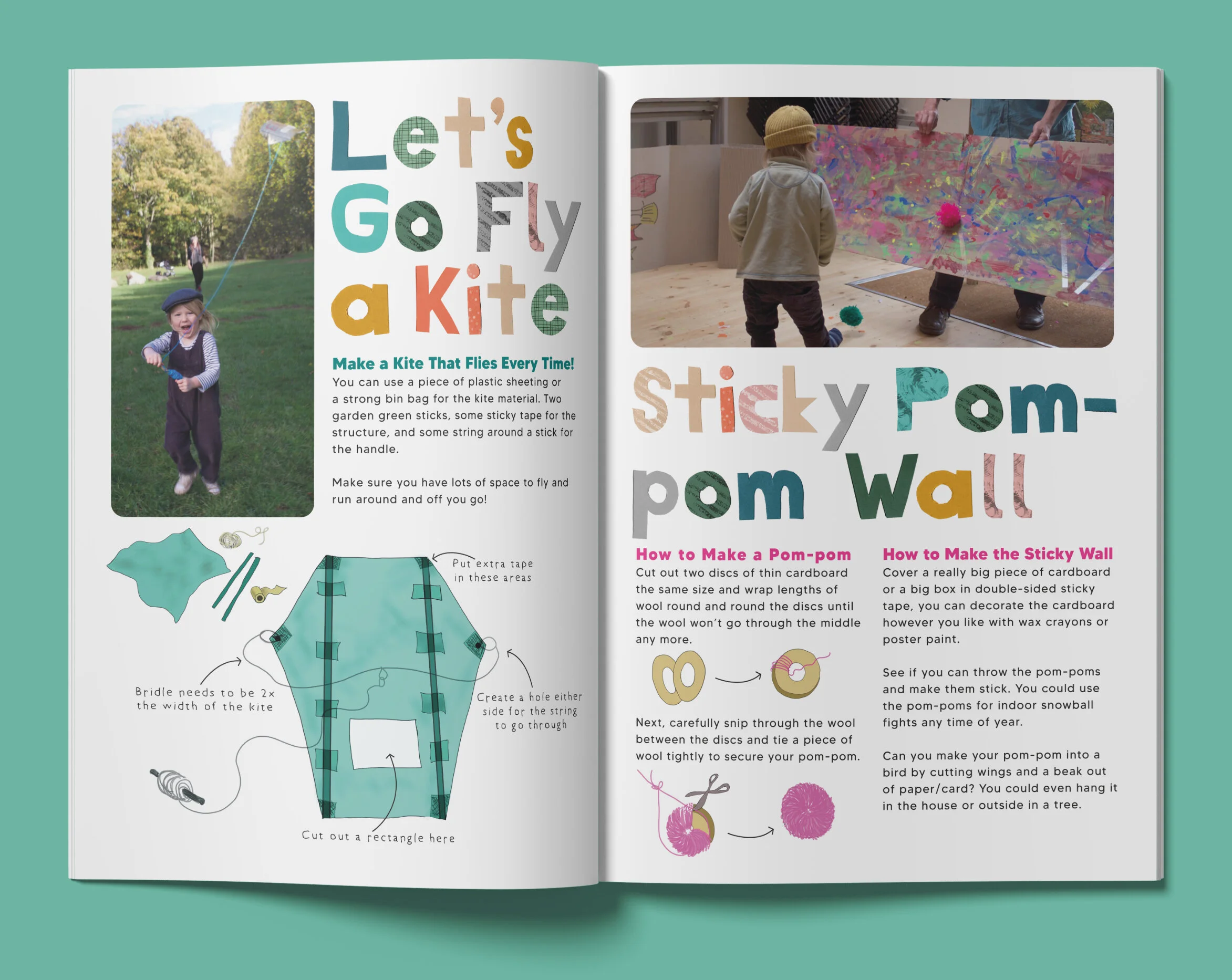
The book was published through Tees Valley Arts with the support of The Ragdoll Foundation, (who produced the Teletubbies!). The photos are all used happily with the permission of parents.

Whippet Up recommend us for 'Professionalism, Quality, Responsiveness and Value' and had this to say about working with us:
“We would like to thank you for all your hard work in pulling the book together. It has been an absolute delight to work with you, your attitude, skills and creativity have shone through throughout the project. The book looks absolutely fantastic! I hope we get the chance to work together again soon and if anyone asks us for any recommendations for design and illustration work we will certainly point them in your direction.””

How Environmentally Friendly are our Products?
We are passionate about delivering the highest quality fine art prints and we are committed to quality. However, it's just as important to us that our print shop is as eco-friendly, and resource-saving, as possible. We take all the steps we possibly can to make this a reality.
We are passionate about delivering the highest quality fine art prints and we are committed to quality. However, it's just as important to us that our print shop is as eco-friendly, and resource-saving, as possible. We take all the steps we possibly can to make this a reality.

The Archival Paper that is used for our prints is made of the highest quality raw materials. The paper is ethically sourced from renewable forests and FSC certified, FSC certification ensures that products come from responsibly managed forests that provide environmental, social and economic benefits. The individual paper can be traced back to the original forest. The paper we use is tested for UV resistance, so your artwork will continue to look amazing over time.

Our postcards and envelopes that the postcards come in are all FSC certified too, our stickers we use on our envelopes are unfortunately not from renewable resources, so have to be put into general waste.
The plastic sleeves that our prints are shipped out in are compostable. Compostable plastics are the next generation of plastics- they come from renewable materials and break down through composting. Compostable plastics are non-toxic and decompose back into carbon dioxide, water, and biomass.

The envelopes we package our prints in are paper-based, with no plastic and are easily recyclable. We also use a water-based 'Fragile' stamp on our envelopes. Water-based ink is much more gentle on the environment than plastisol ink. It simply doesn't contain any of the toxic chemicals of its plastisol counterparts.
We tape our prints to the centre of the envelope to prevent any corners from being bashed. We use washi tape for this, which is an eco-friendly alternative to plastic adhesive tape. Washi tape is an adhesive tape made from traditional Japanese paper. It is biodegradable and can be made from different kinds of tree or plant fibre. The adhesive side is made from natural rubber adhesive.


A Dog's Breakfast Book Cover
Michael McGeary, The Memoir Man, came to us with a request to design the cover of a book he was producing on behalf of a client who had enjoyed a very successful business career: Mike Dawson, OBE.

Michael McGeary, The Memoir Man, came to us with a request to design the cover of a book he was producing on behalf of a client who had enjoyed a very successful business career: Mike Dawson, OBE.
Abby was delighted to get chatting to Mike right away about producing the cover design for his autobiography "A Dog's Breakfast". Having led a successful and much-varied life, underpinned by adventure, hard work, and a love of black labradors, he had come up with a strikingly original idea for the cover of his autobiography...all he needed was for us to bring the idea to life for him.

The cover would feature a black labrador eating breakfast, his bowl of biscuits spilling all over the floor, with the biscuits depicting various items from Mike's life.
Mike was brilliant to work with, and we both understood how important it was to get the cover right on what was to become a gift to span the generations. We wanted the cover to look playful, busy and exuberant. Abby was always smiling and chuckling whenever they chatted about the project's progress...Mike is a true character, with a warm and self-deprecating humour, and we wanted to get some of that charm into the cover design.

“Abby+Owen created exactly what was required and played a major role in me being able to provide a stunning final product. I hope to work with them again and have no hesitation in recommending their services.”
“Abby is a very talented graphic designer, she brings a fresh, clean and cheerful approach to designs of any nature. Importantly she can work within a tight brief or left to bring her own ‘take’ on a project, either way, she uses her own remarkable imagination. During my long business career, Abby is up there with the best. I am pleased to recommend her.”
We are delighted to have played our part in making this beautifully presented, professionally written book a reality. A big thank you to Sarah from Kinship, a husband and Wife Studio who created the perfect layout for the book, and recommended us for the cover design!