

The Challenge
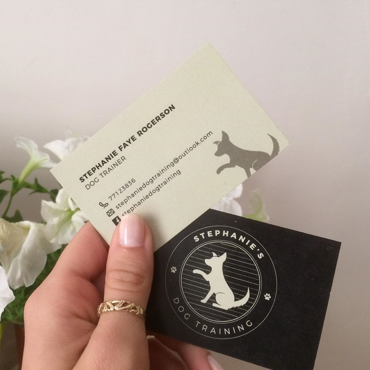
It was important to set Stephanie’s Dog Training apart from competitors, so this logo was developed with Stephanie’s love of contemporary logos in mind. Using an iconic circular shape, clean lines and modern fonts, it is vastly different from typical logos in this industry. Stephanie was keen to use a dog icon as the main feature.


The Solution
I based the illustration on Esther, Stephanie’s dog, to give the brand a more personal touch. This adds a little personality and uniqueness to the brand. We went for an earthy, grey-toned palette to avoid the clinical blue and turquoise that is often used for pet services, and this adds a warm, friendly feel to a business that is all about creating a strong bond between owners and their dogs.

“I had seen Abby’s previous work and reached out in hopes she could offer advice with my brand and create a unique visual for me. I was thoroughly pleased with my decision to work with her, not only was I offered support and advice throughout the whole process Abby also reminded me of my options and what would work best explaining the entire process to me and how any implications could arise.
She happily went back and forth discussing designs and colours until I was 100% on my design, I was never rushed and pushed into making decisions and Abby even checked after the process was finished that everything was working ok and functioning on all social media outlets.
Without a doubt I would recommend her as most of all I felt my brand was safe in her hands! I can’t thank you enough Abby.”